Implementation »
The music had a strong psychedelic feel to it, with a twist. The instrumentation was all electronic. Probably quite groundbreaking at the time.
The video had may early computer graphic images, lots of geometric forms
with colourful random patterns. There was a limited color palette, then again early computers had a limited color range. The whole thing left me with images of old sprite graphic on early home computers such as Spectrums, Commodore 64s etc and electronic displays such as graphic equalisers.
Some of the pattern in the video were almost a precursor to the random graphics founder in iTunes Visualiser and other media players
My idea was to do something with incorporate geometric pattern or random forms
Because my intention was to produce something abstract in nature i opted to start with one of my mark making trials , with a view to trying something in illustrator next.

I used this a a starting point. The brush strokes were made long and deliberate. I worked the brush in two directions to get the criss cross pattern
First I converted it to a smart object. That way I could apply, remove, re-apply filter non destructively (and often!!) until I came up with a combination which would work for the card.

The extrude filter made this rather pleasing pattern. It was really in keeping with aspects I was looking for. It had strong geometry in the form of protruding columns and a a lot of variation in terms of differ and angles and the recesses of the columns
The A4 sheet is much bigger than the canvas so I was free to move it around attempting to get different variations.

I also varied the setting with the extrude filter to get different look.
I really liked the sharpness produced by the pyramid option. It conjured images os stalagmites and stalactites.
I tried applying other filters on top of this and stumbled across glowing edges.


I immediately thought wow!, fantastic! It had all the elements I was looking for randomness in colour, strong geometric forms, it even had that elaborate visualizer feel. Jackpot!
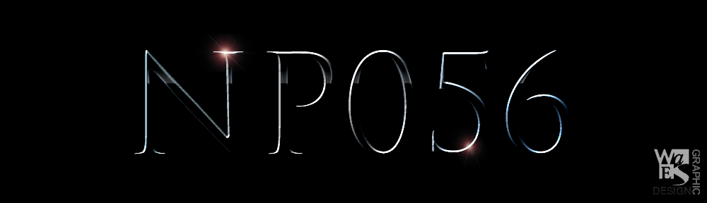
To finish I chose zekton font from dafont.coms sci fi collection A very clean, simple sans-serif with a futuristic touch. It
felt this was in keeping with the cover.

My only concern is maybe its a bit fine. Not sure if it gets lost a little bit in the graphic. AT the same time I didn’t want something to heavy as I was intent on placing the text in a single line so as not to obscure the design. On screen its seem alright. A test colour print will prove if its the right choice or not.
To give it emphasis I added a strong red underline. The purpose of which was to help distinguish it from the rest to the design.
There are no lyrics for this song so I opted to do a variation of the front cover. Just changed the extrude setting from pyramid to blocks to get a surprisingly different result.

Less cluttered than the front, yet a great design
Reminiscent of pixel graphic.


